Home Blog Page 146

Living the RAW Dream Through Kaleidoscope by Wood D

Whenever I get the chance to present my work publicly, I’m always honored and humbled by the opportunity. I’ve been working as a photographer professionally for over two years now. As hard as it is to get noticed, it’s even harder to be exhibited. I’m very excited to present my most recent work at the upcoming RAWartists “Kaleidoscope” showcase, on June 23, 2013 at Penn Social. Being a part of this show means identifying with the RAWartists philosophy, which is to promote independent, underground, new and emerging artists.

In 2009, Heidi Luerra birthed RAW after realizing there weren’t any real outlets for underground and unknown artists. She put together an art showcase in Los Angeles, California with multiple artists from different backgrounds. After much success with the first showcase, she expanded the company into southern California, and eventually across the country and worldwide. Daraja Asili is the D.C. Director.

Now one wouldn’t think that I’d have any worries displaying my work in this showcase considering I had my first art showing (The Love Showcase) back in March, but this is on a bigger level. “Kaleidoscope” will feature artists from all avenues including fashion, hair, makeup, visual art, performing art, photography, and film. This showcase is about placing myself, among others, on a platform bigger than I could ever imagine. “Kaleidoscope” is a platform for promoting all arts and artists from all walks of life — from the technically trained to the self taught, from first-time exhibitors to seasoned professionals.

Until now, I’ve been working and promoting myself on my own. It makes it a lot easier when you have a support system –like RAWartists– behind you. However, knowing that I’ll be featured among other artists can be a little intimidating. My main hope is to show that I’m more than just a fashion and event photographer. I want my images to show that “I capture moments”, instead of just taking pics.

I draw inspiration from almost everything in life, and there’s variety in what I’m showing in Kaleidoscope. I’m showing images from DC, NYC, and even my family hometown Pacelot, South Carolina. Choosing which images to put on display is never an easy task, because all of my pictures are like.. well, my babies. My Kaleidoscope images are slightly different from my first showcase, because those pictures focused on my love for DC, love for NYC, and the first love story of Adam and Eve. These images are candid moments, and my scenic work. I try to choose images that speak to the soul, images that will spark a conversation, or better yet images that are just plain dope!

Love On a Train, Black and White Photo (c) Linwood Davis, 2012

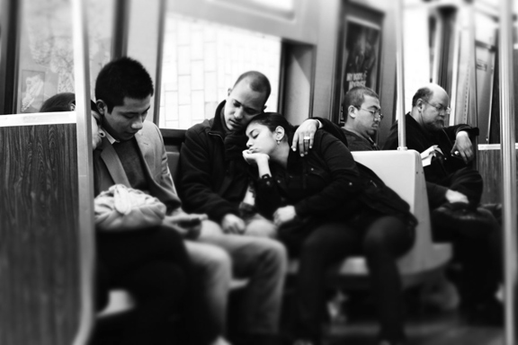
The image “Love on a Train” displays one of those candid moments you rarely get to see, at least not through a camera lens. I took this picture because it captures that unconditional love.. that “I don’t wanna be with anybody else right now but you” kind of love. Another image, “A Stranger Amongst Friends”, I like because while everyone else in the park was laughing and mocking this man, he was in his own little world not caring at all. I took time to notice how he was communicating with the birds as if they were his companions, he even had names for them. He may have been a stranger to me, but he was definitely in the presence of friends.

Growing as an artist is very important to me because I’m always evolving into a better version of me. I want my photography to speak for itself one day, instead of me speaking for my work. I know this showcase will push my career as a photographer to new heights, I just hope and pray I’m ready for whatever comes my way.

Wood D (Linwood Davis, Jr.) is a DMV-based photographer featured in the upcoming RAWartists “Kaleidoscope” showcase. Wood has been doing photography professionally for two years now, but always had an artistic eye from a young age. Wood loves photography because it gives the creative freedom he needs to truly express himself artistically. Not only does he enjoy capturing moments, but he also enjoys the satisfaction of knowing he has helped other people (models, designers, makeup artists) fulfill their dreams as well. Wood feels a sense of calmness and serenity behind the lens.

More information about the next upcoming event can be found at http://www.rawartists.org/washingtondc/kaleidoscope. Make sure when you buy tickets you select “Wood D the Photog” as the artist to support.

The Body as Concept and Constant by Judy Byron

As 2011 begins, I find myself re-visiting some professional pleasures of 2010 and realizing that this all seems very far away from being the girl who was raised to marry her boss and clean house.  Growing up in a home where girls didn’t go to college, I catapulted myself out of my family and into adult life as a drama major immersed in the philosophy of Stanislavski and Method Acting.  While in college I realized that visual arts is my voice and at the same time came to an activist awakening that brought me rich life lessons as an organizer for Eugene McCarthy’s anti-war presidential primary campaign, and Cesar Chavez’s Consumer Grape Boycott in 1968.

My work is still informed by my undergraduate studies and my experiences as a community organizer, now reinforced by the performance art of the 70’s (particularly feminist artists Suzanne Lacy and Eleanor Antin.)  As an artist and activist, through my works on paper, my installations, and artist books, I explore the power of the female figure and voice to express aspects of identity, while affirming the connections between art and society.

Until ten years ago, I worked primarily in community and commissioned public art, displaying life-sized woodcut rubbings of individuals and groups in locations relevant to the subjects. Now, continuing to embrace Method Acting’s belief in the constant dynamism of one’s inner and outer life, I draw to express through body language and clothing what each of my female subjects has brought to a moment in time. Wetting and fitting handmade paper to the subject, I create life-sized, softly cast 3-D drawings that references the figure without disclosing identity. Attached to lighted silhouette backgrounds, these shaped clothing pieces, with audio accompaniments, are intended as mirrors into one’s self and as conveyors of our shared humanity.

The first two installations of the series were Where I Live and What MattersWhere I Live referred simultaneously to the site of the exhibition, to the location of each person’s identity, and to the source of my own creative exploration. What Matters continued my exploration of creative voice in both personal and political contexts by incorporating audio for the first time. These series allow me to continue to combine my love of drawing with my passionate interest in issues of identity. They also allow me to integrate lessons from community organizing, allowing me to engage larger social questions by hosting salons and evenings of conversation in my home studio as part of the work’s display.

Perfect Girls, the next installation in the series, opens in April 2011 and continues the use of my own self–reflection as the catalyst for creating work within a larger cultural context. This time, I will consider the “perfect girl” as a paradigm of our society. Drawings of my own coming of age in the 1950s and those of a 16 year old girl whom I have drawn at ages 5, 8, 13, and 16 (Naomi) will be displayed with audio collected from “Conversation Dinners” I hosted, and from Naomi herself, who has kept an audio journal.

Continental Drift will complete the series by considering identity through the cultures of other countries and the drifting influence between these cultures and the United States.  I began work on this project by traveling to Brazil in January 2010, where I photographed details from sidewalks, toys, products, netting, foliage, clothing and detritus.  I will travel to China and to Ghana to collect visual textures from those continents and these particular countries whose people have immigrated in large numbers to the US. These images will influence large color pencil drawings inspired by each country’s textures, and will allow me to work with women who have emigrated here.  Continental Drift is scheduled for exhibition at American University Museum at the Katzen Center in late 2012 or early 2013.

Looking back, I realize that the threads that launched me from adolescence – community organizing, theatre, visual arts and feminism have stayed as my constants.  Looking forward, I welcome their continued impact on my artistic growth and creative evolution.  And I realize I keep a pretty clean house.

Judy Byron studied theatre at Ithaca College and art at the Corcoran School of Art and Design. Her work on paper has been recognized by the National Endowment for the Arts, the Mid-Atlantic Arts Foundation and the DC Commission on the Arts and Humanities. Her permanent public works hang at sites including the School of Social Work in the Tate Turner Kuralt Building at UNC Chapel Hill, Service Employees International Union and the Urban Institute.

Byron’s solo exhibitions include “Artists + Communities” at the National Museum of Women in the Arts. She has participated in many group exhibitions, such as “Picturing Politics”, “Art Against AIDS”, and  “Sweet Sixteen”. Byron’s work is part of the Brooklyn Museum’s Elizabeth Sackler Center Feminist Artist Base. Collections include the Corcoran Museum, the NMWA, the Library of Congress, Rutgers University, the U.S. Embassy in Bogota, Columbia and Absolut Vodka. She is included in 100 DC Artists edited by Lenny Campello(Schiffer June 2011).

Byron founded CAMP, an Artist Mentorship Program for the Corcoran Museum of Art, which was honored as a national model by the NEA and the President’s Commission on Arts and Humanities. She will complete her clothing series with “Perfect Girls” followed by “Continental Drift”.

Edited by Ellyn Weiss

Originally published Jan 18, 2011

La Belle Arti by Mimi McCormick

0

This article was selected as a finalist in the 2012 DC Student Arts Journalism Challenge, an annual competition designed to identify and support talented young arts writers.

Art speaks. It transcends language barriers and, to put it in the most trite way possible, has its own language. A universal way of using emotion, color, form, texture, and other nonverbal methods to communicate with every individual that stands before it.

Many people would agree with this. Others would not.

The art connoisseur stands before a painting at the Musee D’Orsay may stand in his or her black turtleneck, wearing his or her Jolly Rancher-colored, thin-frame glasses, with his or her arms crossed. The person next to him wears a lime-green fanny pack, jeans, blindingly white sneakers and a scrunchie, metro maps and guidebooks spilling out of his or her back (high-waist jean) pockets. Approaching is a university student who is studying abroad for the semester in Galway, Ireland. The man who now moves on to the painting to the group of strangers’ right holds his four-year-old daughter’s hand and says, “And this, here, is Sisley. Alfred Sisley.”

This all takes place, however, in the same, elongated hallway that showcases the classic, renowned works of the impressionist masters. People come from all of the world to see them. Thus, it’s no surprise that there are tourists from Texas, Parisian locals, and university students taking advantage of their discounted entrance fees. This is Paris. This is Monet.

There is, however, another especially unique exhibition of art that draws diverse crowds and perspectives and outfits. It’s not the Uffizi Gallery, nor the Pitti Palace. The omnipresent Medici’ family has somehow failed to stamp their seal of commission on these works. Instead, it is organized by Americans in Florence, and materializes twice a year, at the end of each academic semester, in a little piazza called the Piazza Donatello, forty minutes away from the herds and gelato stands by the Ponte Vecchio. And the people you find there – the ones who stand before the works, arms closed, child in hand, university sweatshirt on, with a scrunchie in their hair? They’re all there. And they all speak different languages. Yet here, they also manage to speak a common language – this language of art.

This is the student exhibition put on each semester by Syracuse University’s study abroad program in Florence, Italy. Each sketch, photograph, painting, sculpture, and mosaic is inviting in its own way. It tells its own story – the story of a foreigner’s overall experiences in a foreign land, with foreign people, for four months. The oil painting of the purple down jacket represents the artist’s awful impossibility of masking her American identity in a land that she just wanted to blend in; the series of sketches that had manipulated clear detail and blurring communicated how the artist had appreciated Italy’s love for expression, passion, and candidness. They are all beautiful works. However, this is not what makes this exhibition so incredibly particular.

Instead, the exhibit in Piazza Donatello draws such vastly different crowds, all of whom come from different worlds; the student, him or herself, awkwardly stands at the snack table as the viewers circulate each room, scaling the walls up and down and left and right. The professors – people from San Francisco, Germany, and Tuscany, cheerily engage with the American parents who are visiting their child for the week. The Italian host families come dressed in their corduroy jackets and puffy coats (even though it’s 70 degrees outside), and even some of the more curious Italian individuals filter in from the surrounding piazza weave in and out of the studios, as well. It’s a mixture of languages, of clothing styles, of sentiments: curiosity, shyness, pride, excitement. And it’s all happening at once.

One girl has painted a series of paintings of her grandmother, a woman from Tientsin, China, who had passed away while the artist had been studying abroad. She had spent ten hours straight in the studio for her first: a rub-out painting of a 1935 photo of her grandmother as a child, the second a stale, hurried dinner setting at a nursing home, and the third, a steaming cup of green tea sitting next to a framed photo of her grandmother’s puckered up face. The girl’s mother had been visiting from New York, and stood still with quiet tears, laying a hand on her daughter’s shoulder. When the Italian mother walked in, stood before the three paintings and broke into an explosive sob, nestling her head into the artist’s arms and squeezing her tight. The student’s peers – the ones who had been there as she had received the news and had witnessed her therapeutic use of brushes and paint, all bowed their heads in approval.

It was a mutual understanding of the strength of love and memory. It was a communal ode to the works and to its subject; in that instant, everyone knew the student’s grandmother. Everyone appreciated her. They were silent, yet had all met in the same moment, same point in the intangible universe of humanity. Italian, American, professor, student, passerby…however different they may have been, they were linked.

This is what makes art incomparable; there is nothing else that exists that can speak so loudly and so universally. There is no other medium that can say nothing and yet say everything the way that art succeeds in doing. And it doesn’t have to be the work of Monet; the work of an Introductory Painting student can tell his or her story through brushstrokes and color and attention, moving people from all walks of life. And that is the power, the great poignancy of art: its ability to create such a beautiful commonality among all of us, as one people.

Mimi McCormick is a senior at Georgetown University but grew up in Rye, NY. She is majoring in English, and minoring in Italian and Studio Arts. In her spring semester of junior year, she spent 4 1/2 months abroad in Florence, Italy, where her passion for all three of her concentrations at Georgetown flourished even more. After graduation, she hopes to return to Italy to continue her studies of art, Italian, and journalism, and to reunite with her host family.

Imagery and Symbolism by Matt Sesow

Since 1994, I have used a unique set of “icons” and imagery to help communicate meaning in my paintings. Below are my explanations for how these “visual clues” might be used to help people better understand the story and intention of my work.

The bunny is a bit of ‘self portrait’ icon. It relates to my intent not to harm others, although a ‘violent’ or unsettled darkness exists within me, as I suppose it does with others, which conveniently might help explain the other things going on around most of my bunnies in several of the paintings. The bunny’s mouth is often presented to resemble my ‘trauma scar’ icon. It’s a nod to the fact that I ‘talk about it’ and that I paint feelings related to trauma and how they might relate to innocence/childhood.

The trauma scar is a reminder icon. Having experienced a series of surgeries as a child following the accident which claimed my left hand, I continue to remember one surgery in particular which left a scar, still visible, on my left arm, and which resulted in a line with three dashes. It was quite painful… to this day, pressure or a blow to the scar causes pain.

A trauma cup is a place to put, keep, hold, and ‘produce’ the emotion. I think of my apartment/studio as the trauma cup I think of painting as a trauma cup. It is a place where I can let loose my inhibitions and explode in a variety of manners… typically with paint. Without the trauma cup, I would not be able to paint, I would not be ‘healthy’. The trauma cup has been a key to my healing.

My favorite color is ‘soviet red’… a nod to the intensity of the propaganda posters used during the cold war, that’s why the lips have to be pure red. When I started painting, I was frustrated by the static nature of paintings. By using slashing lines and ‘punching the painting’ I try to get motion and emotion. By using huge lips, and long rows of teeth, I want the viewer to see or guess if there is a smile, a frown, a grimace, yelling, screaming, reaction. Emotion.

For my paintings, the airplane has represented evil. It is the ‘great amputator’, the bomber, the one that destroys summer evenings. It usually shows up when I ‘paint by remembers’ and when trying to make a statement about one of the many aggressive actions countries with power take against innocent civilians.

Like many, I see the eyes as a pathway to the soul, the ‘tell no lies’ part of everybody.
I use eye color to help tell the story of my subject. Two orange is evil or aggressive, two blue is innocent or ignorant, one blue and one orange is balanced. A mix of blue and orange on each pupil represents a sort of ‘self actualization’ or complexity/mystery. One eye hidden or closed produces the same effect.

The phoenix represents my current state of mind while creating the painting, or the state of mind of the person(s) in the painting. It is a barometer of mental state If the phoenix/bird is pointing down, that signifies depression, failure or self-loathing… that I must try harder. If the phoenix/bird is pointed horizontally, it signifies a confidence in self without need or desire to change or challenge; however, there is no struggle and thus not much artistic growth. A rising or a declining phoenix is the best for good art and means that I am being challenged.

This star is associated with the business model I use for the sale and marketing of my paintings. It is my nod to the socialist polity. The idea is that original paintings (not prints) are for the masses, for the people, not just a select few within the bourgeois.

I began to embrace and develop the bull symbol while preparing for my first solo exhibition in Europe. I realized that rather than being a bunny, I needed to be a bull. A controlled bull. I needed confidence and strength. The bull is smiling. He is nice. You won’t eat him and he won’t attack you. But he is very strong, confident, and he oftentimes has a bunny, a rising phoenix, a trauma cup, or a star inside to keep him honest and to make him remember and remain slightly vulnerable.

‘The dogs’ are a result of a multitude of influences. First, they associate comfortably with the tag I had been given at the early part of my art career as a folk or outsider artist: they are crude, colorful, and loud. The primary influence of my dog paintings was birthed while I was at my first artist residency, in Ciudad Colon, Costa Rica (2003). The residency was inspirational; I painted over 100 works, but the largest influence was the ‘interruption’ of other artists, interested tourists, and the constant barking dogs. So ‘folk art dogs’, are representative and dedicated to artists being asked to create ‘on demand’ and in non-familiar surroundings…. with the best intentions.

© matt sesow 2010

Editor’s Note: This piece is excerpted from a longer piece originally published by Matt on his website. Click here to read the entire piece on his site. To see more of Matt Sesow’s painting, click here. To see his bio on his site, click here.

Top image in this post is Sesow’s ‘Scoundrel’. Originally published on Bourgeon May 12, 2010

Rehoboth Beach Memory 4/28/1982 by David R. Findley

1

Time to bathe al fresco
watched by frosty stars and a crescent moon.
I twist quickly for warmth
beneath needle-like strands of hot water
dispensed by an ancient showerhead,
its shadow stretched on white painted wood.
Steam clouds ride past the eaves
into a clear night sky beyond. Surely the burnt offering
over my head is sweet.

David Findley was born in Kansas City, MO. His parents’ families have  roots in the Missouri Ozarks, but his family transplanted itself to Northern Virginia when he was 5 years old.  He received a BA in English,  with Distinction, from UVA in 1976.    His poems have been published in Potomac Review, and he has taken poetry writing courses with Hilary Tham and Henry Taylor via the Writers Center in Bethesda MD.